In my last blog post I shared some statistical information on diabetes in Trinidad & Tobago. This data came from the cso.gov.tt, which I had requested a few weeks ago. Most of you who read my blog already know that I’m fascinated with data visualisation, especially visualising data in Trinidad & Tobago.
Aside from making the information on diabetes available online, I decided to go a step further and use the information from each region in Trinidad & Tobago and generate a heatmap.
A heat map (or heatmap) is a graphical representation of data where the individual values contained in a matrix are represented as colors. […]
Source: Wikipedia
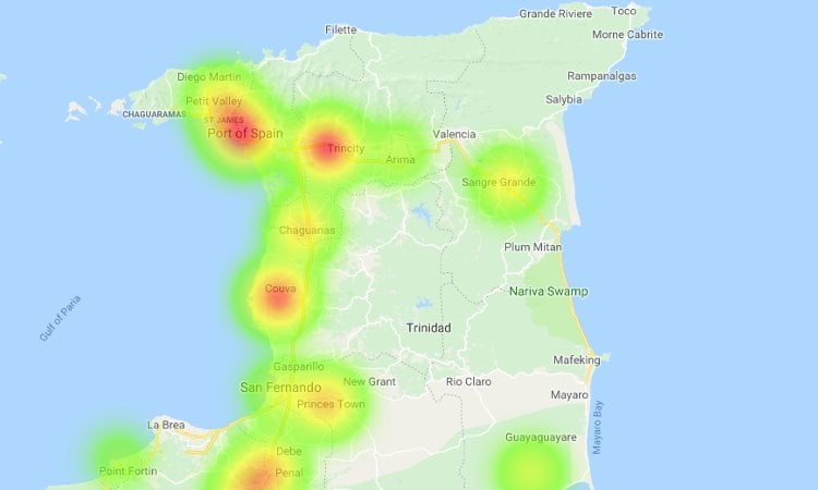
Diabetes Heatmap
For the heatmap, I plotted each region in Trinidad & Tobago on a Google map. I then used a simple formula based on the total amount of people with diabetes to generate a visual representation of diabetes in each region of Trinidad & Tobago.
Here is the link to the diabetes heatmap.
Looking at the map you’ll notice red areas, which show the highest concentration of people with diabetes in that region. The yellow areas represent regions where the concentration is high. The green areas represent regions where there is a low number of people with diabetes.
You’ll notice there’s quite a lot of areas that aren’t represented. This is because the data I used to generate this map was specific to a region.
I used the latitude and longitude of a populated area in that region as a marker for the visualised data. If I had data for each town in Trinidad & Tobago, the heat map would be more accurate.
Conclusion
A heatmap is an interesting way to visualise geographic areas that have high concentrations vs low concentrations. Looking at the map above, one can quickly extract which areas of Trinidad & Tobago most people have identified with as having diabetes.
At some point I may tweak the formula to give a slightly farther reach. Another idea involves using colours more suitable instead of the red, yellow and green.
If you have any questions or comments about this little experiment, please don’t hesitate to contact me using the contact page.