It goes without saying that the price of everyday items in Trinidad & Tobago is fairly expensive; especially for 20% of Trinidad & Tobago’s population, who live below the poverty line. With 1,218,208 people living in Trinidad & Tobago, that’s roughly 260,000 people who struggle to make ends meet (The World Factbook).
In one of my previous posts I wrote about visualizing data, which was a summary of my process for finding and using relevant sources of data to generate interactive maps or graphs.
I came across a document last week from the National Agricultural Market Information System (NAMIS), which contained spreadsheets of historical wholesale agricultural prices from 2006-2017, for quite a number of food items grown in Trinidad & Tobago.
Bananas, bodi, cabbage, oranges, dried coconut, ginger, plantains, paw paw; but to list a few. Each month of the year has a record for type of item and the price for (x) amount of items.
I spent the last few days converting the document into an interactive graph that plots, compares and contrasts the price for each item for every year since 2006.
Remember, these are wholesale prices, so what you’re seeing is what your local supermarket chain would probably pay. As a consumer, you would obviously be paying more.
The results were not surprising. If you’ve been doing groceries in Trinidad over the years, then you already know how the price of items have changed over the years.
I’m not an expert in agriculture or Trinidad & Tobago government policies, so I won’t make any speculations or assumptions about the data. However, when you’ve read the newspapers or watch the news, every once in a while there’s a glimpse into how the farmers and government interact.
In 2016 the Guardian news paper published an article titled “Farmers: Don’t sideline our produce”. The article explains how locally grown food items are being sidelined for imported items.
The Guardian also published another article in 2016 titled “OH MY CHICKEN!”. The article was written in response to reports about imported frozen chicken that was arriving 180 days old. It continues on about the problems local poultry farmers face.
There’s also some good news. The government does recognise there are problems. The Ministry of Agriculture has various training programs and incentives listed on its website.
A few months ago I added an agriculture section to Hermitt.biz. The motivation behind it was to give local farmers a place to sell their produce by having them list their items online. Google, Bing and other search engines would pick up their ads and make their items available on the web. Anyone searching for produce in Trinidad & Tobago would be able to find locally grown items from farmer.
NAMIS was developed by the National Agricultural Marketing and Development Corporation (NAMDEVCO), which is the statutory body responsible for agricultural marketing in Trinidad & Tobago.
NAMDEVCO collects retail and wholesale prices from various markets in Trinidad & Tobago. Retail outlets including supermarkets, municipal markets, farmers’ markets, road-side vegetable stalls and mini-marts throughout Trinidad & Tobago. Information is stored in the NAMIS database and a sample made available online.
You can read more about NAMDEVCO on the NAMDEVCO website. You can also find more information about NAMIS on the NAMIS website.
As previously mentioned, the document contained data on agricultural items from 2006-2017. Some of data present in the document included the items, wholesale price of the quantity per month and the yearly average price.
You can find the document on the NAMIS website or you can download it directly Historical Monthly Average Wholesale Prices 2006-2017.
Personally, I dislike working with spreadsheets (I’m not sure any developer does). It’s not a database, I can’t run queries against it; to use it in most modern web applications requires parsing the spreadsheet data into a format understood by the application using it.
I converted the spreadsheet to a CSV file, removed irrelevant data and then imported the results into a database. Since this was just another experiment in visualizing data, I didn’t have time to normalize the information before inserting it to the database.
In a normalized form It would be much easier to run ad hoc queries for some interesting results. Perhaps if anyone shows some interest in the graphs, I might consider normalizing the data.
To graph the data I used the JavaScript graphing library Chart.js. I had looked at a few graphing libraries, but settled on Chart.js; mainly because it’s free, it’s opensource, it’s well documented and working with it was simple (kinda).
Updating the graph with new data proved to be tricky, when items are selected from the menu. There’s a lot of items in the database, I wasn’t about to generate a graph manually for each item, that would take too long.
I could have just handpicked some items and generated graphs for them, but looking at such a small segment of data is irrelevant, especially if using the data to find trends.
Populating the graph with data simply requires selecting an item from the menu. Selected items make a request to the database and the results returned in a JSON file. The JSON file is loaded along with some settings applied and then the graph is generated.
There were several graphs available, to display the data. I tried using a radar graph, but it was a little difficult to pick out data individually. I ended up settling on a simple line graph.
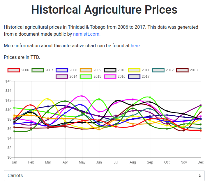
The graph generated for each item contains quite a bit on data. Prices are listed on the Y axis (left) and months on the X axis (bottom); you can easily discern the price of the item for that month.
The legend (top) contains the year the item prices were recorded. Instead of displaying one year at a time, I plotted them all together. It’s much easier to find trends for the item with the years superimposed.
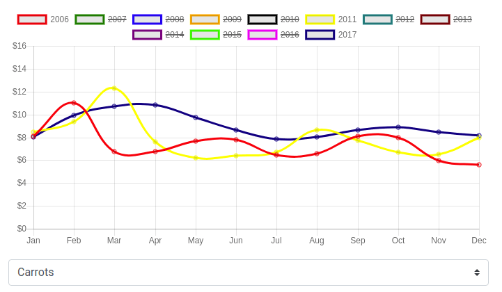
You can also choose which year or years to see the prices for the selected item. Below is an example of the wholesale price of carrots in 2006, 2011 and 2017.
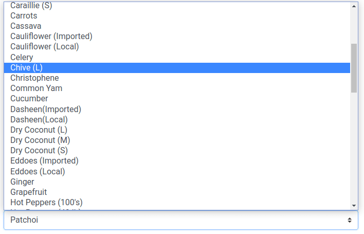
The list of items is fairly extensive as I had mentioned before. Here is a segment from the list.
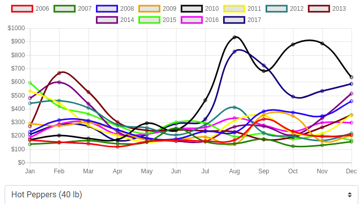
Here is a screenshot of what the data for Hot Peppers looks like from 2006-2017.
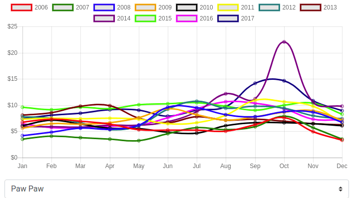
This is Paw Paw from 2006-2017.
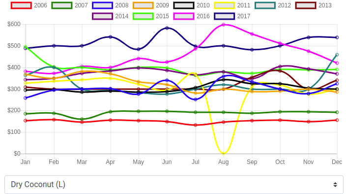
Here is Dry Coconut (L). Obviously the price of one large dried coconut can’t possibly be this expensive. That’s because it’s for units of 100’s. I’ll add the units sold into the drop down, just to make it clear.
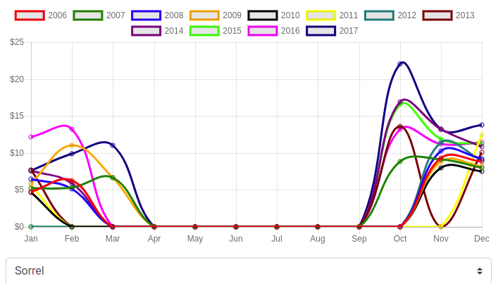
Notice how Sorrel has no data from April to September? At first it confused me, but to my understanding sorrel is seasonal.
If you’d like to try out to interactive graph, you can do so freely by heading over to the Historical Agriculture Prices page.
Thanks for making it this far, I hope you all enjoy the little interactive experiment. If you encounter any errors or would like to converse about the results, you can contact me using the contact page.
In a previous article I wrote about creating and registering a new twitter application. Creating…
Creating a new Twitter application requires several important steps. First we must register a new application,…
Anyone familiar with the old search console knows that manually adding each URL or even…
On Monday March 26th, Fishermen and Friends of the Sea (FFOS) had their request for…
In my last blog post I shared some statistical information on diabetes in Trinidad &…
I my last blog post I wrote about diabetes in Trinidad & Tobago and tried…